
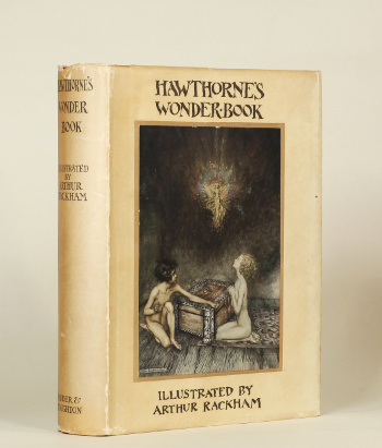
HAWTHORNE, Nathaniel and Arthur RACKHAM (artist). A Wonder Book. London, New York & Toronto: T. and A. Constable Ltd. for Hodder & Stoughton Ltd, [1922].
Quarto (243 x 186mm), pp. viii, 207, [1 (imprint)]. Colour-printed frontispiece and 15 colour-printed plates, all mounted on cream paper with light-green printed frames and with tissue guards bearing printed captions, 8 colour-printed plates from [?wood-engraved] blocks, and one wood-engraved plate, all after Rackham. Wood-engraved vignette on title, wood-engraved headpieces, and wood-engraved initials, all after Rackham. Original red cloth gilt, upper board lettered in gilt and blind, and with design in gilt after Rackham, spine lettered in gilt, decorated endpapers with illustrations after Rackham, top edges black, printed dustwrapper with mounted colour-printed illustration after Rackham. (Some light spotting on endpapers, unobtrusive light marking on boards, extremities very lightly rubbed and bumped, dustwrapper slightly marked, edges creased and with short tears causing minor losses.) A very good, clean copy in the original cloth, with the rare dustwrapper.
SOLD
Notable for the ‘fascinating series of illustrations printed in three muted colours’ – with the rare dustwrapper illustrated by Rackham
First edition, trade issue. Arthur Rackham (1867-1939) taught himself to paint as a child, before enrolling for evening classes at the Lambeth School of Art as a teenager. At Lambeth – where his fellow-students included Charles Shannon, Charles Ricketts, and Thomas Sturge Moore, all of whom would become successful book-illustrators and artists – Rackham studied under the landscape painter William Llewellyn, while working during the day as a junior clerk in the Westminster fire office from 1885 to 1892. Rackham began to submit illustrations to magazines, and in 1892 he was employed by ‘the Pall Mall Budget as a news and features illustrator, and the following year he moved to the Westminster Budget and the Westminster Gazette. By now he […] was widening his practice by illustrating books for publishers. His name and reliability for delivery and content became known to publishers and public alike, and he was increasingly in demand. Rackham’s first notable successes, which coincided with the beginnings of the fashion for lavishly produced gift books, were illustrations to The Ingoldsby Legends (1898), Gulliver’s Travels (1900), and Grimm’s Fairy Tales (1900)’ (ODNB). In these early titles, Rackham’s illustrations have the appearance of woodcut-engraving – a medium employed by Shannon and Ricketts to illustrate their Vale Press books – but from 1905 to 1910, as printing techniques developed and with them the possibilities for book illustrators increased, Rackham used sharper, finer lines to produce the remarkably intricate and complex images for which he is known.
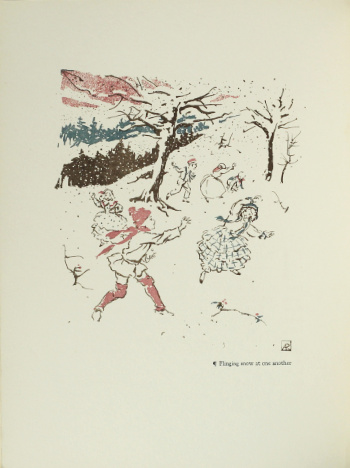
The American writer Nathaniel Hawthorne (1804-1864) first published his retellings of Greek myths in 1852 under the title A Wonder-Book for Girls and Boys, and the book enjoyed great popularity both in the United States and abroad, with numerous editions appearing through the nineteenth century and into the twentieth. The buoyant market for finely-illustrated and -produced books which had sustained expensive illustrated editions of Rackham’s books in Edwardian Britain was greatly diminished by the privations of World War I and the economic problems of the immediate post-war years. Rackham’s edition of A Wonder Book is particularly interesting for the use of both mounted colour-printed plates (which had illustrated Rackham’s previous books since Rip van Winkle in 1905) and colour plates printed directly onto the leaf from blocks. As Fred Gettings commented, ‘[f]or once it is not to the mounted full-colour plates that we immediately turn our attention in this book, but to the fascinating series of illustrations printed in three muted colours and probably prepared by Rackham as separations. Rackham must have looked closely at the lithographs of Vuillard and Bonnard before he produced these prints, and again at the Japanese prints which were the common heritage of all three artists. […] The finest of these [illustrations] show the decorative Rackham at his best […] combining within the soft decorative elements the Rackhamesque lines in a delicacy of style which is the logical conclusion to the three-coloured silhouettes of Cinderella and Sleeping Beauty of the previous year. Now the harshness of the black flat pattern […] is gone; the colour does not stand out in meaningless isolation but is integrated into one single harmony of muted tones’ (Arthur Rackham(New York, 1976), pp. [142]-143).
Clark, Nathaniel Hawthorne: A Descriptive Bibliography, A18.29; Latimore and Haskell, Arthur Rackham: A Bibliography, p. 55.